Cop or Drop
2022/23 CLUB Kit EditionFrom the footwork family
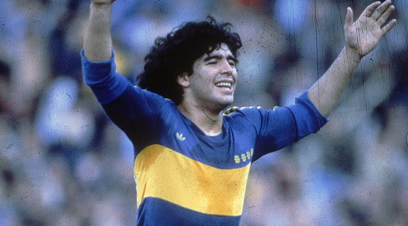
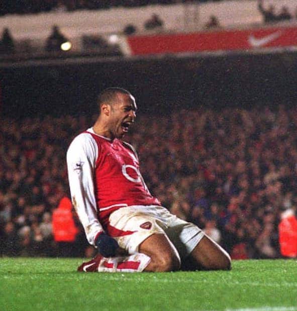
If you follow us on Instagram, you know we love a good kit. It embodies that link between fashion and sport, setting the stage for team support, city style, and of course the day party vibes. In my opinion, soccer is up there with skateboarding in terms of sport/style reflection. And when done right, the image is lasting, influencing future remakes and dominating the vintage stores of your cities’ hipster areas. Think Boca Juniors. One large, yellow stripe across a blue background with probably none other than Maradona underneath. Think the classic long-sleeve kits of Arsenal with (O2) displayed across. Henry sliding into the corner. Barcelona’s Mount Rushmore of stars draped in the sharp and iconic Catalan red, blue and yellow. These images transcend team identities, bringing local cultures and colors around the globe.

BUT we also love to hate a bad kit and although we certainly won’t rock it, it’ll keep us talking, laughing, and comparing. The rumored 2022 USA World Cup kits are the talk of twitter akin to a late 90’s rec-league kit. If legit, I can’t believe that made it through even the first design meeting. Kit’s truly divide opinions. For instance ESPN ranked the 95’/96′ Away ensemble of Manchester United as the 2nd worst kit of all time. Sir Alex even famously had them ripped up at halftime while losing, claiming his players couldn’t see eachother. But have you seen it? Honestly, I would rock that in the coolest parts of Hamburg every day of my life. And that’s the beauty of it, small brands sometimes take bigger risks and big brands also fall flat on their faces. And so that’s where we come in, to claim our cops and our drops for the 2022/2023 season. Clubs only. International we’ll hit you with come this weird, winter World Cup.


DYLAN:
COP
1. Venezia Home, Away, Third– They did it again. All 3 are top gun. Relegation to Serie B had to have hurt the wallets but if they continue to produce works of art in their kit design and branding, they’ll stay afloat.
2. PSG Away – The Grey is bliss. Say what you want about PSG. Qatar money, farmer league, choke artists. But when they slap that Jordan logo on a kit with a crispy color, I slap my credit card on the table. 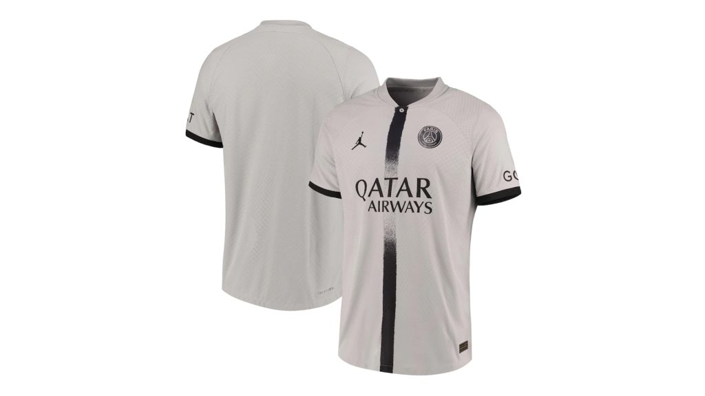
3. FC Lorient Third Kit – Thing of beauty. My club has Umbro too but I can hardly celebrate when compared to this confetti/sprinkled cream-colored work of art. 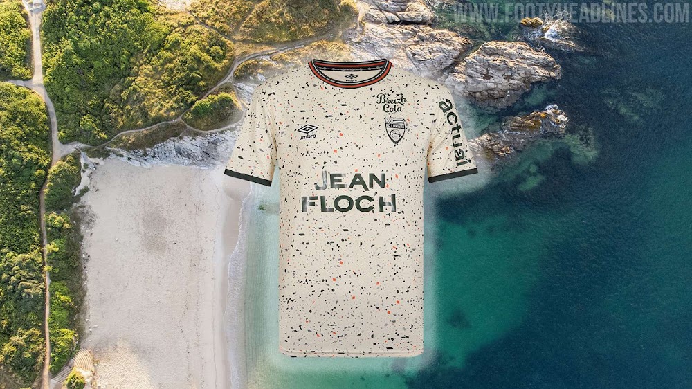
Honorable Mentions: United Home/Away & Arsenal Away
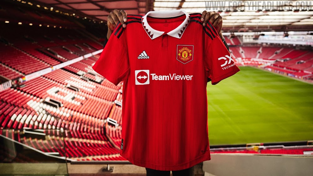
United stepped it up. The third kits divide opinions with the highlighter color but the home and away are fresh and done right. Pop the collar for bonus points. Arsenal away is just clean and the all black is done to perfection. Didn’t reinvent the wheel or anything but sometimes you don’t need to. Also Atletico have polar opposites this year and the good one is the away kit. Foreshadowing to come.
DROP
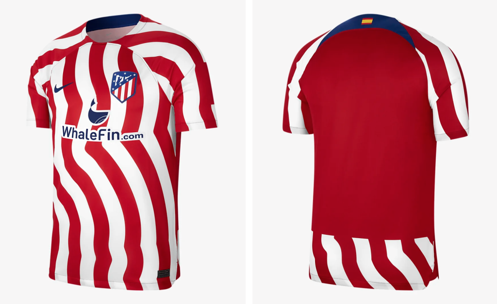
1. Atletico Madrid Home– The squiggles do no one justice and certainly do not hypnotize me into liking this kit. It’s no surprise they’re super low -selling. Focus groups are encouraged for 2023/2024. Or just follow in the footsteps of your away kit because thats pretty.
2. Arminia Bielefeld Third Kit– Certainly no bounce-back from relegation to the second Bundesliga. Haven’t the fans suffered enough?? Looking like a solid rec-soccer jersey or Tour de France kit. Traurig. 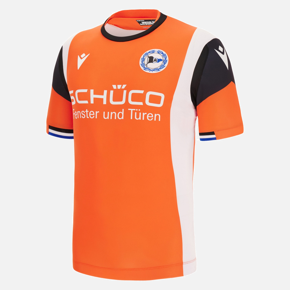
3. Wolverhampton Wolves Home– Shows where their marketing and design budget is at. A club so rich in history and the only thing that stands out is the boldness of the sponsor. Sad.

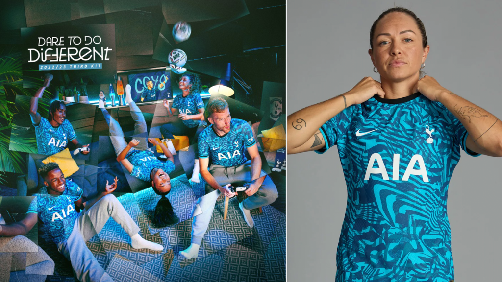
Honorable Mention Tottenham 3rd : Pick three colors and throw them together, boom, splat.
TYLER
COP
1. Ajax Away– Always do well with the away and third kits. Home kit is a staple that doesnt change much. Away kit has a unique navy blue. Touch of gold in the badge, along with the trimming makes this one pop.
2. Manchester United Home– Throwing it back to the Catona days with the collar + triangle design. Classic colors with the white edging makes this one a beauty. A team that desperately could use some Catona leadership and fire, unfortunately has to deal with Bruno & Ronaldo’s antics.
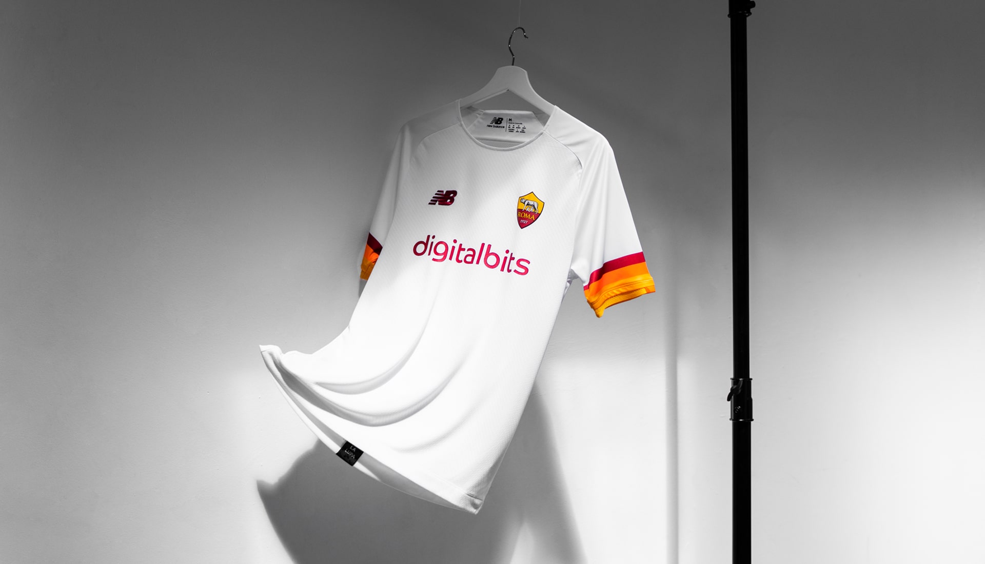
3. Roma Away– Absolutely class all white kit with the touch of Roma’s colors. Dybala & Tammy look incredible and will fight in the league with this truly, classic kit. Simple but majestic. SPQR.
Honorable mentions- Milan Home– touch of italy and gold for the champs, Venezia Away- touch of Ireland with the colors, no sponsor just the club name
DROP
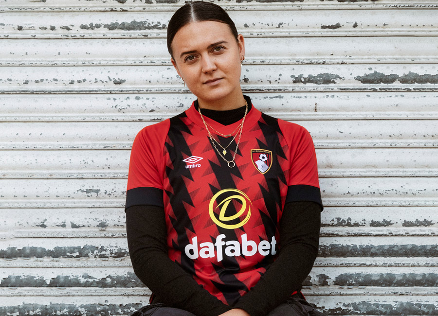
1. AFC Bournemouth Home– Rendition of their classic home kit but upright stripes turn into awful, black lightning bolts. Very tough to look at, let alone root for. Next.
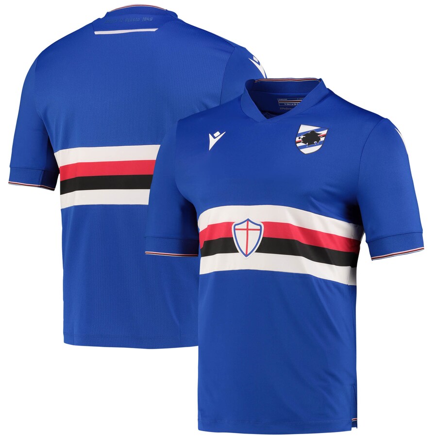
2. Sampdoria Home– Kit & marketing team needs new players almost as bad as the first team. The cross stripes in the middle of the kit show how little of a brainstorm process went into it. Invest in the squad and keep it simple on the shirts.
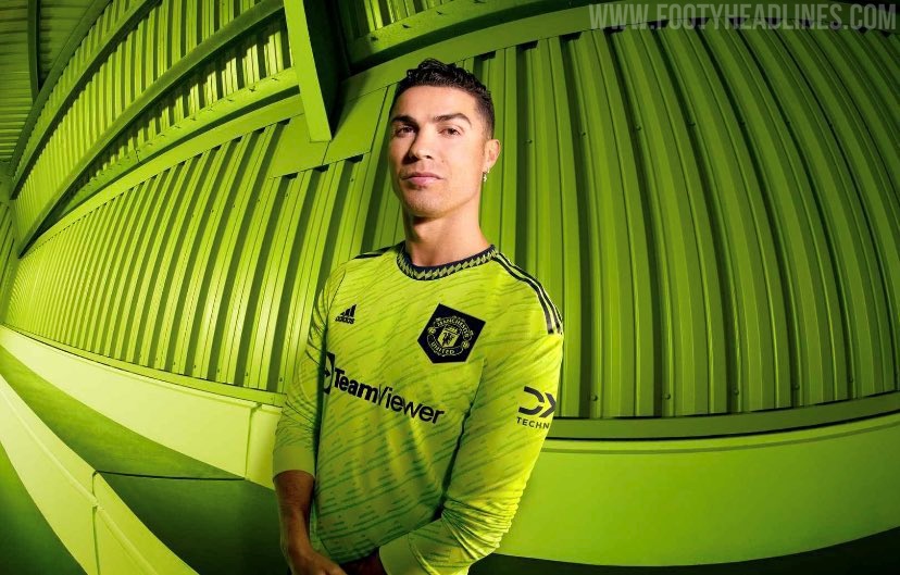
3. Manchester United 3rd Kit– As well as they did for the 22/23 home and away kits, they threw it away with the 3rd. A color that has no place on a football kit, let alone a ManU kit. Tough to look at, especially when you lose 4-0 to Brentford in the tennis ball & mountain dew colored 3rd kit.
Honorable Mentions- Tottenham Away– brutally slapped together, looks like a high school team trying to be unique but failing, Barcelona 3rd– the whole kit is taken over by the blue and red cross shaped design, must of had a lack of funding for kit design, Atletico Home- the squiggles instead of the classic straight lines speaks for itself, terrible.
JACK:
COP
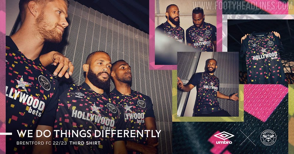
1. Brentford Third Kit– looks like a space invaders theme and i’m here for it.
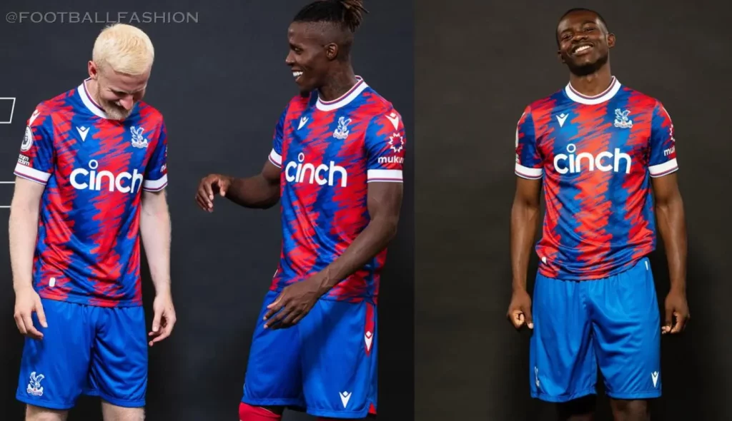
2. Crystal Palace Home– Classic Red and Blue I just feel they never miss with their jerseys.
3. Leicester Home– Class Class Class. I’m a sucker for a collar.

DROP
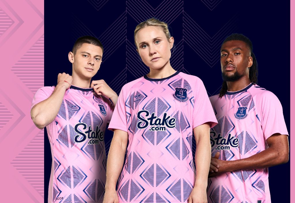
1. Everton Away– But, why pink? Literally no understanding behind it.
2. Manchester United Third Kit– This puke inspired jersey speaks to the form Man U has started in insert* (dry heave sound).
3. Manchester City Away– Atlanta United Home?At first I thought it was a joke but seriously they should get kicked out of the Prem for using another team’s work.
SEAN:
COP
1. Arsenal Away: What’s not to like when you have a black jersey with black/gray designs accented with gold? This kit is crispy.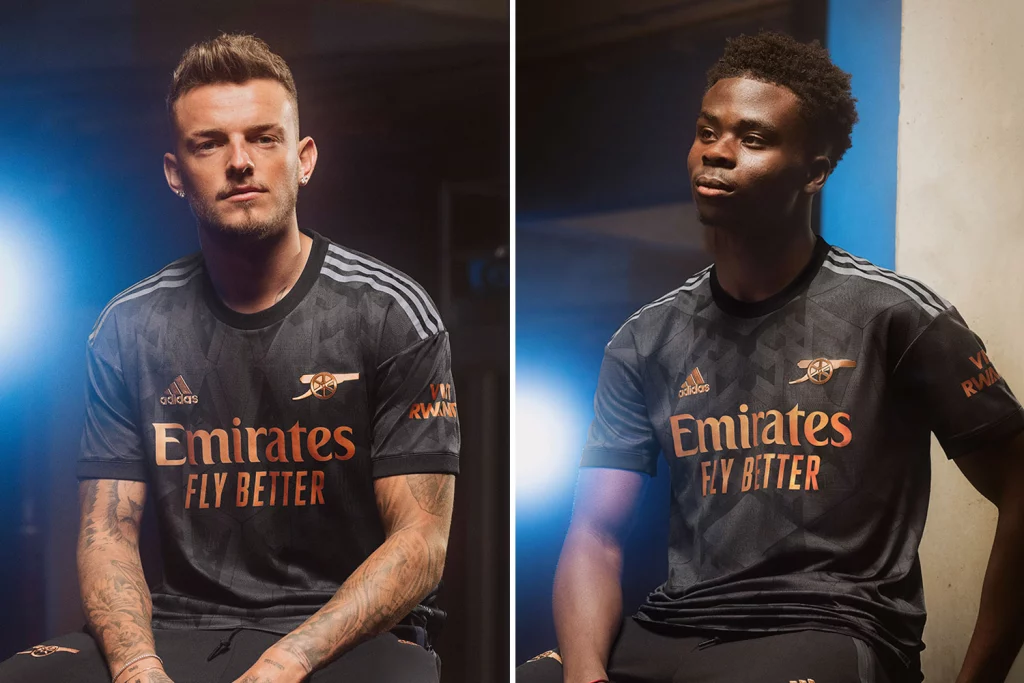
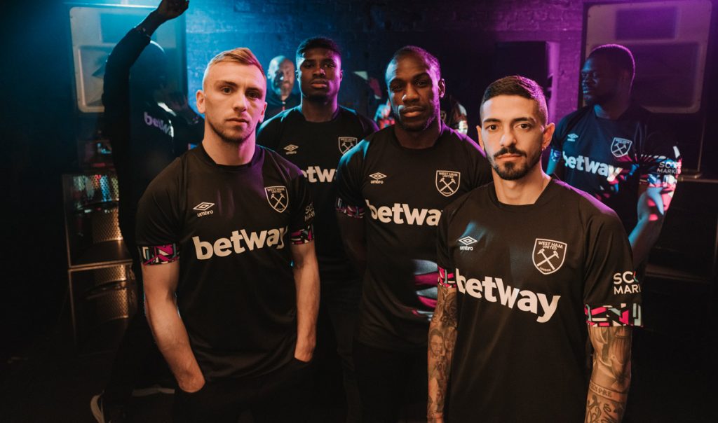
2. West Ham Away: Similar to the Arsenal away kit, there is beauty in the simplicity of this one with a touch of creativity at the end of the sleeve. Also, the Umbro in itself earns swag points.
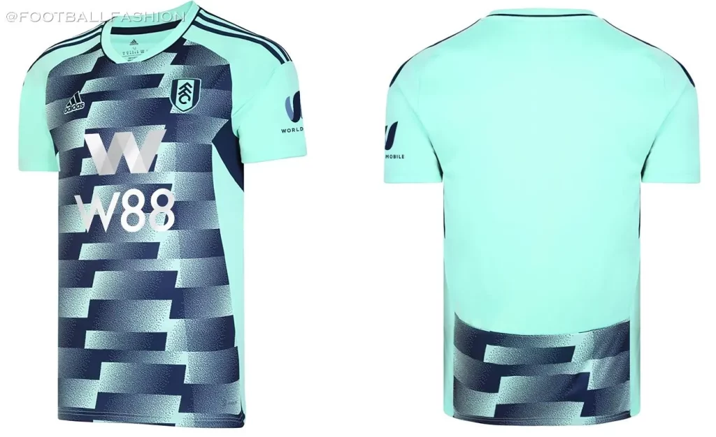
3. Fulham Away: This one is loud but I dig it. Nice teal/green color with a unique pattern on the center of the kit. Surely a kit I would love to wear on and off the pitch.
DROP
1. Man United Third: As if the situation at Man U needed to get worse…what are we thinking here with this design and color? The color of this highlighter green is simply put, UGLY. Does a great job at highlighting the mistakes of el capitano HARRY. Too Far?
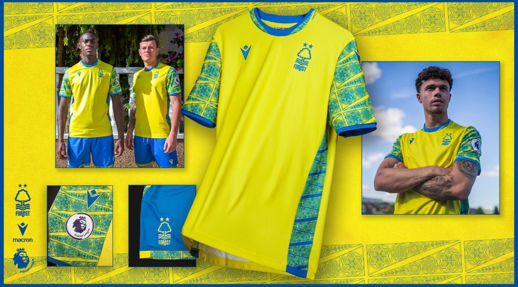
2. Nottingham Forest Away: Huh? I get it, they’re excited to be back in the Prem, designer wanted to make a statement but these colors together just don’t make sense. For some reason the colors remind me of a kindergarten classroom where our very own Jack & Wagsy are throwing crayons at each other and/or not coloring inside the lines.
3. Tottenham Away: Just no. I would love to hear the conversation behind this one. Did a group of designers sit around a table and say yes, this looks incredible? I don’t get it.

WAGSY:
COP
1. Tottenham 3rd Kit– I’m sure this won’t be a popular take but something about them makes me happy. Some sort of old school looking rug with a touch of whatever the proper term is for a modern lava lamp. Get in Spurs, its ugly and I love it for it’s personality.
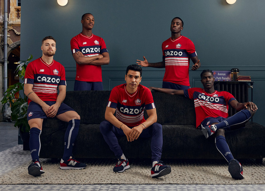
2. Lille Home – As the great Jidenna once said, “I’m a classic man, you can be mean when you look this clean.” This has the gross Cazoo sponsor on it and it still looks like a pair of khakis with some white sneaks and a perfectly fitting V-neck. Wouldn’t expect anything less from Les Dogues. Class dog, class fit.
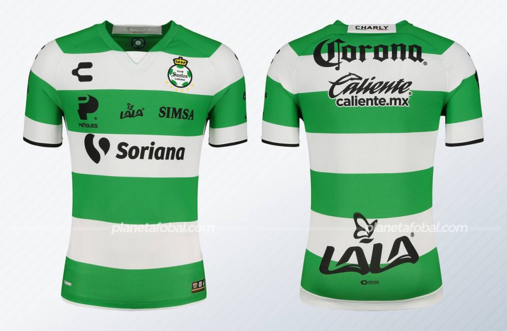
3. Santos Laguna Home– Just a nod to the heritage here. Sure it is Liga Mx where they collect sponsors on shirts like I used to collect monopoly tabs from Large Fries, but it works. Keep the hoops, keep the pride of Mexico looking great.
DROP
1. Nottingham Forest Away
This is repulsive. I’m not sure if it is the halfway Norwich vibes or what but my 8 year old niece could design better. Regardless of what is said above about my artistic eye just know this would never find my name on it. Full price at the team store but it comes with a barf bag so that is a nice gesture.
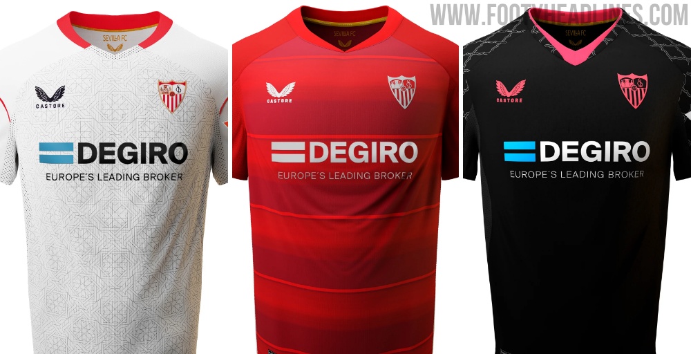
2. Sevilla Home, Away, Third – Classic spain. Take the check and slap as many logos as possible in it. Sevilla usually bring the heat and I tuned in last weekend and saw billboards and weak designs.
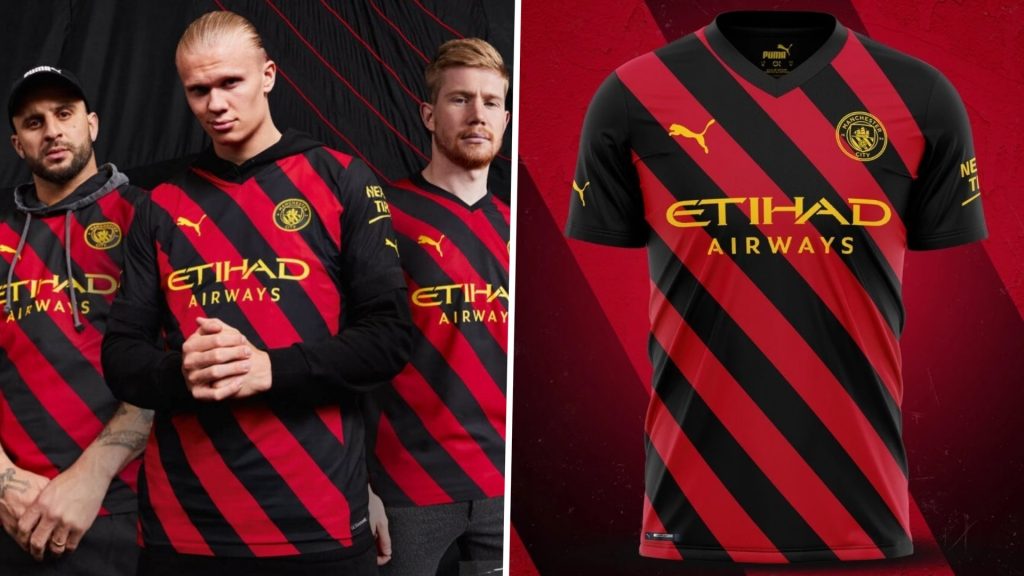
3. Manchester City 3rd Kit– Just have always felt Puma is hit or miss with their kits. This one is a miss. You won’t touch those 2010-2014ish Chelsea Neon vibes so stop trying.